RGB is light; ink is not. That single fact explains most of the frustration designers feel when a screen-perfect colour prints wrong.
RGB is made of light
Screens create colour by mixing Red, Green and Blue light. The range of colour light can produce (its gamut) is large and vivid — and every monitor renders it slightly differently.
That means the same file can look different on two screens, let alone between screen and paper.
Print is made of ink
Printed colour reflects light rather than emitting it, and inks can't reproduce every bright RGB colour. Vivid on-screen blues and greens often dull when printed.
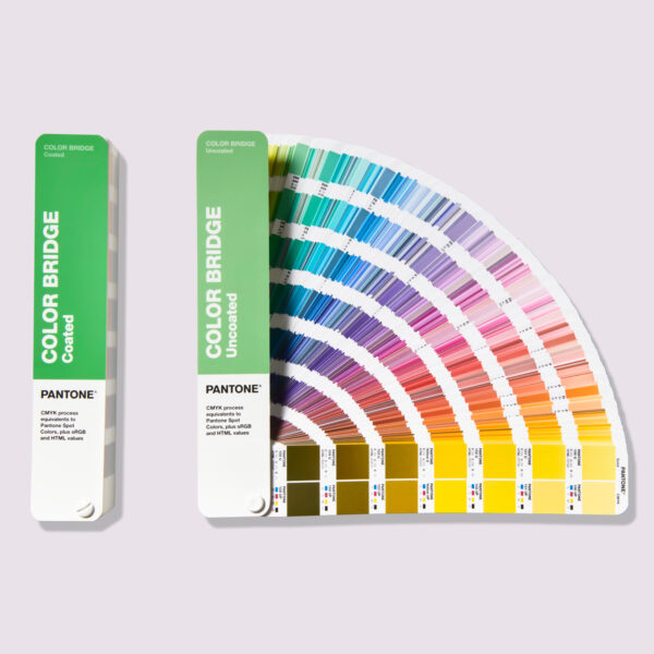
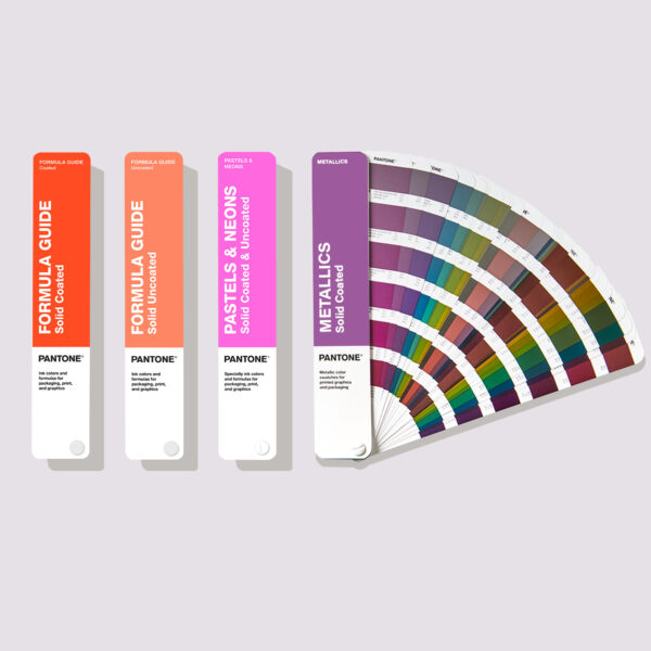
A physical Pantone reference removes the guesswork: you judge colour on a printed swatch, not a backlit screen.
How to bridge the gap
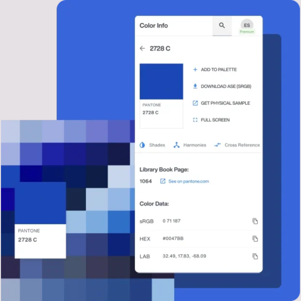
Specify brand colours as Pantone references, then use the Colour Bridge to see realistic CMYK and screen equivalents. Judge final colour on printed material under controlled lighting, never on a monitor alone.