A spot colour is the simplest idea in print: one exact ink, mixed to a recipe, applied in one pass. Simple — and remarkably powerful for consistency.
One ink, one recipe
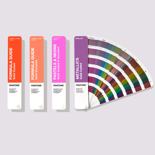
Rather than simulating a colour with dots of four process inks, a spot colour is a single ink mixed to a precise formula before printing. The Pantone Formula Guide lists those formulas.
Because the colour is pre-mixed, it reproduces consistently regardless of the press or operator.
Why brands rely on it
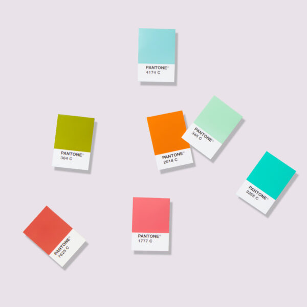
A brand colour reproduced as a spot colour looks the same on a business card, a billboard and a delivery van. That consistency is what makes colour a recognisable brand asset.
Spot inks also achieve colours — fluorescents, metallics, clean pastels — that process printing can't match.
When spot isn't the answer
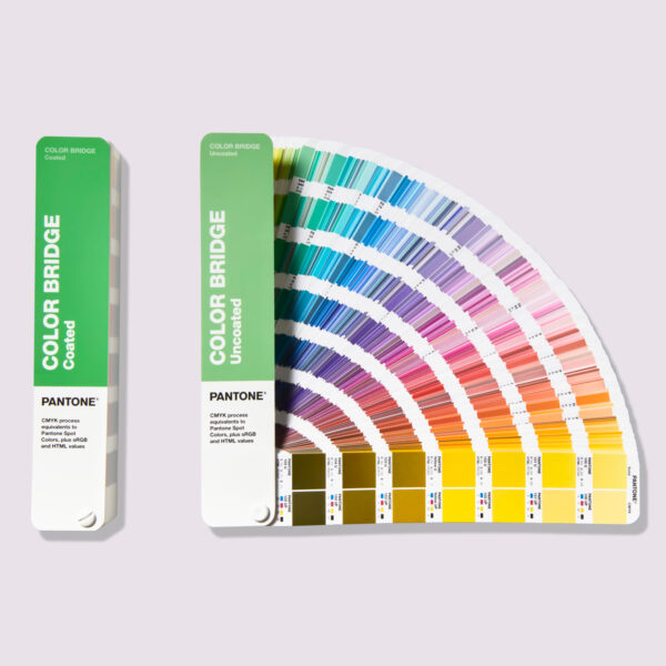
Full-colour photography needs process (CMYK) printing; adding many spot inks gets expensive. The practical approach is often CMYK for images plus one or two spot colours for brand elements.