Pantone and CMYK are not rivals so much as different tools. One mixes a single, pre-made ink; the other builds colour from four. The trick is knowing which your job needs.
What Pantone (spot) colour is
A Pantone spot colour is a single, pre-mixed ink applied in one pass. Because the colour is mixed before it hits the press, it looks the same every time — which is exactly what a brand needs.
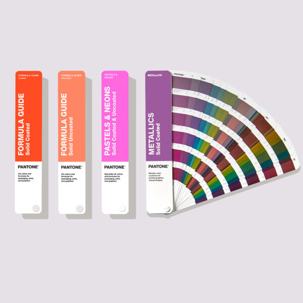
Spot colours can also reach vivid, metallic and pastel shades that four-colour process simply can't reproduce.
What CMYK (process) colour is
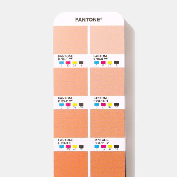
CMYK builds colour from tiny dots of Cyan, Magenta, Yellow and Black. Layered together they can create full-colour photography and complex artwork economically.
The trade-off is consistency: small shifts in ink, press and stock can nudge a CMYK build off-target between runs.
When to use each
Use spot colour for brand colours, logos and anything that must be exact across suppliers. Use CMYK for photographs and full-colour imagery where absolute precision matters less.
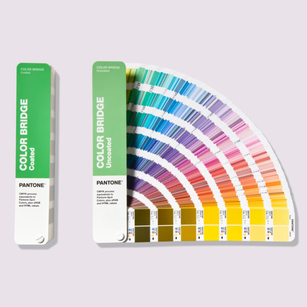
Many jobs use both — CMYK for images plus a spot colour for the logo. The Colour Bridge shows how a spot colour will look if you have to build it in CMYK.